Reuse Mobile — iOS & Android Design Kit
The ultimate design kit for beautiful and visually consistent iOS and Android app designs.
-
How does it work?
This resource was specifically crafted for flexibility in designing iOS and Android apps. All components are fully responsive in Sketch with Symbols, pre-defined Resizing Properties and Smart Layout.
In essence, Android has its Material Design language and iOS has its Human Interface guidelines. This resource aims to bridge and simplify both design paradigms. The ultimate goal is to help you save time in designing apps that are unique in nature but consistent in design style for both mobile platforms.
With hundreds of strategically grouped and organized elements, you will be able to quickly drag-and-drop, customize, or mix-and-match iOS and Android sized components. Additionaly, you will be able to choose between Dark and Light component versions and explore many pre-designed app screens.
-

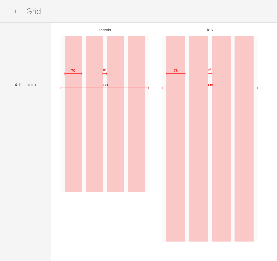
Consistent grid used in all pre-made iOS and Android screens
-
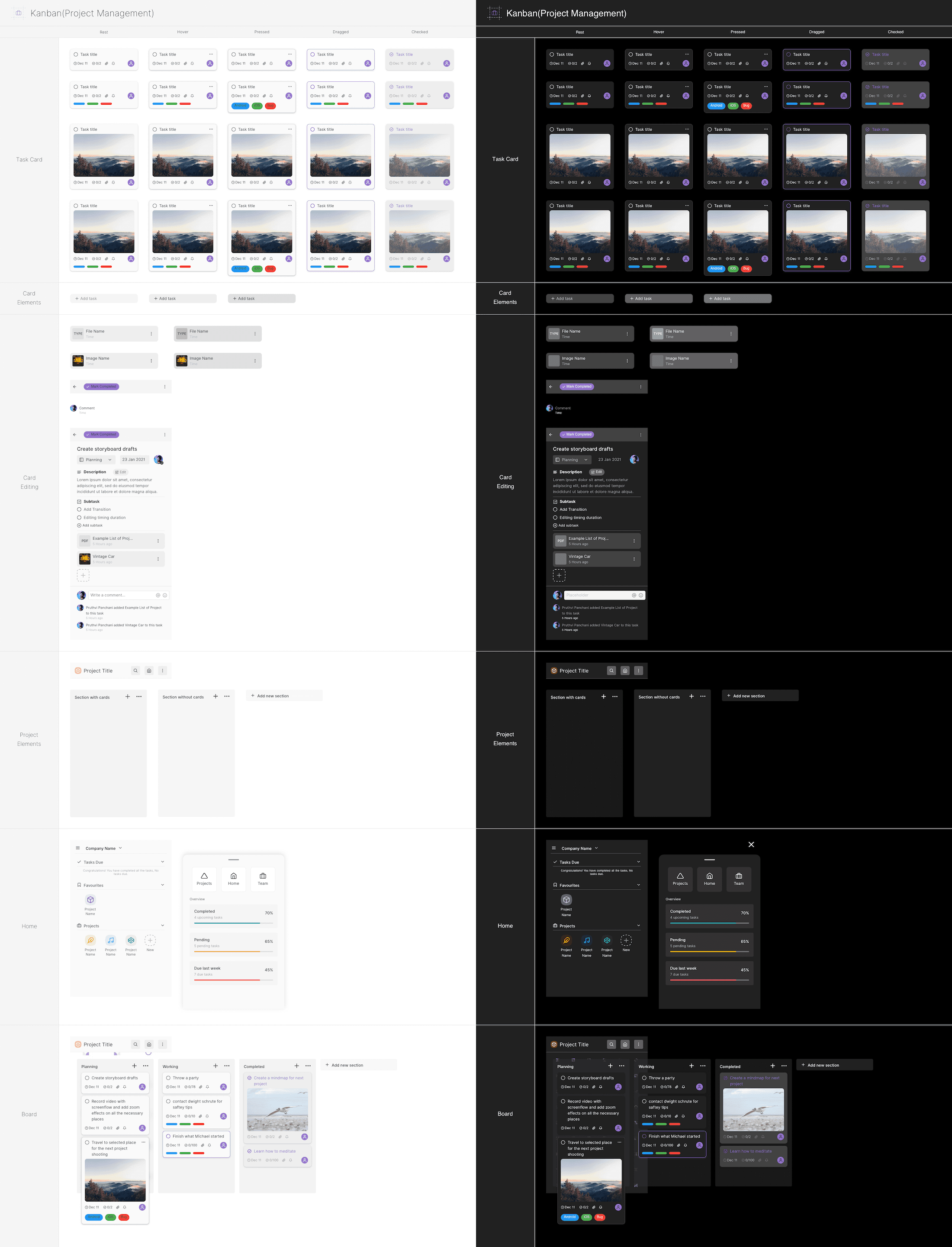
Example of Kanban project management components
-
What's included?
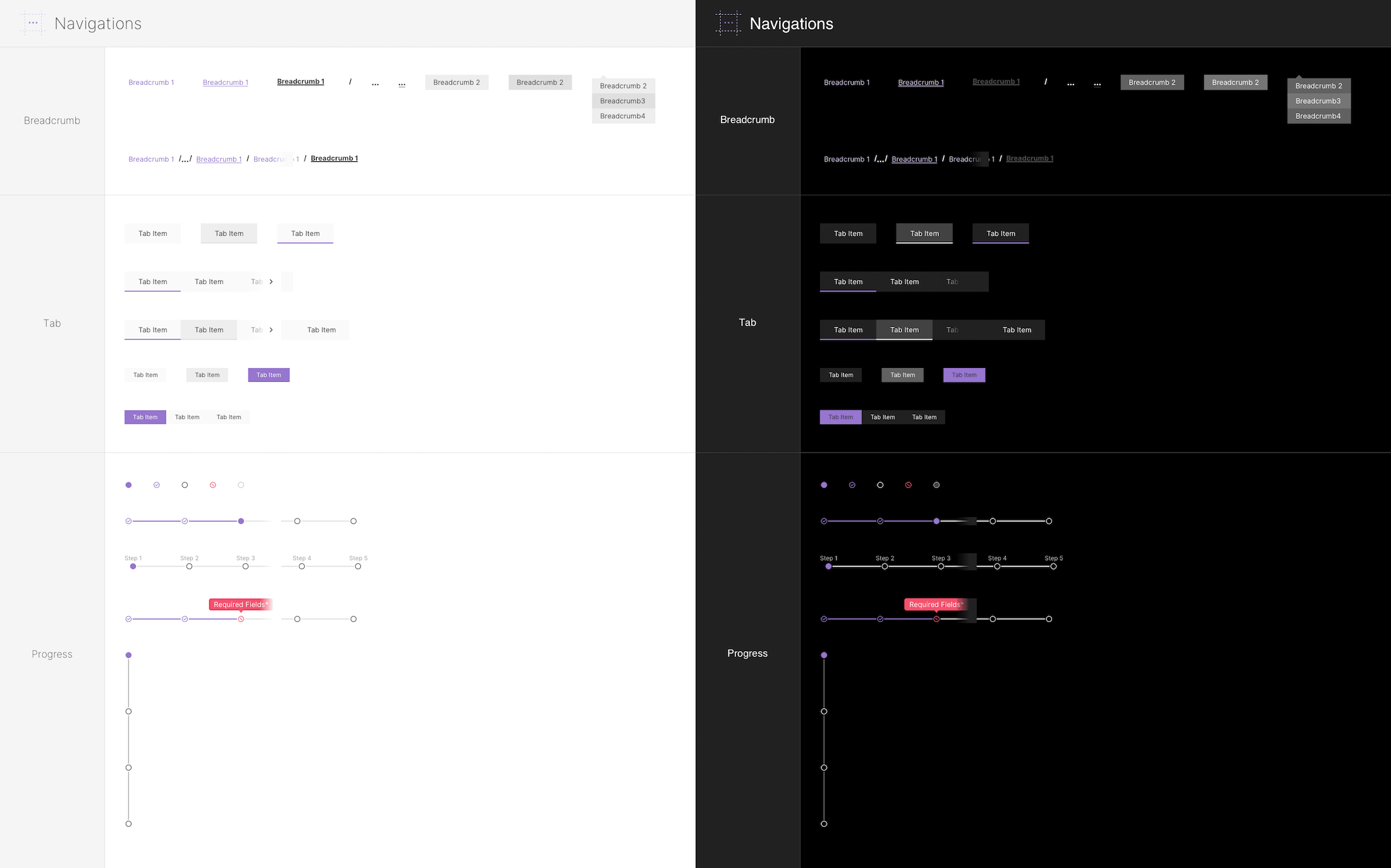
Over 1600 components that are carefully organized in multiple categories: Buttons, Text Fields, Complex Text Fields, Controls, Form & Data Inputs, Accordion & Content Switchers, Navigation, Views, Pickers, Charts & Chart Elements, Small Charts & Cards, Avatars, Media Player Elements, Code Snippet Previews, List & Data Tables, Pop-ups & Modals. See the video for more details.
All components are organized as Symbols in familiar groups so that you can find all desired elements efficiently.
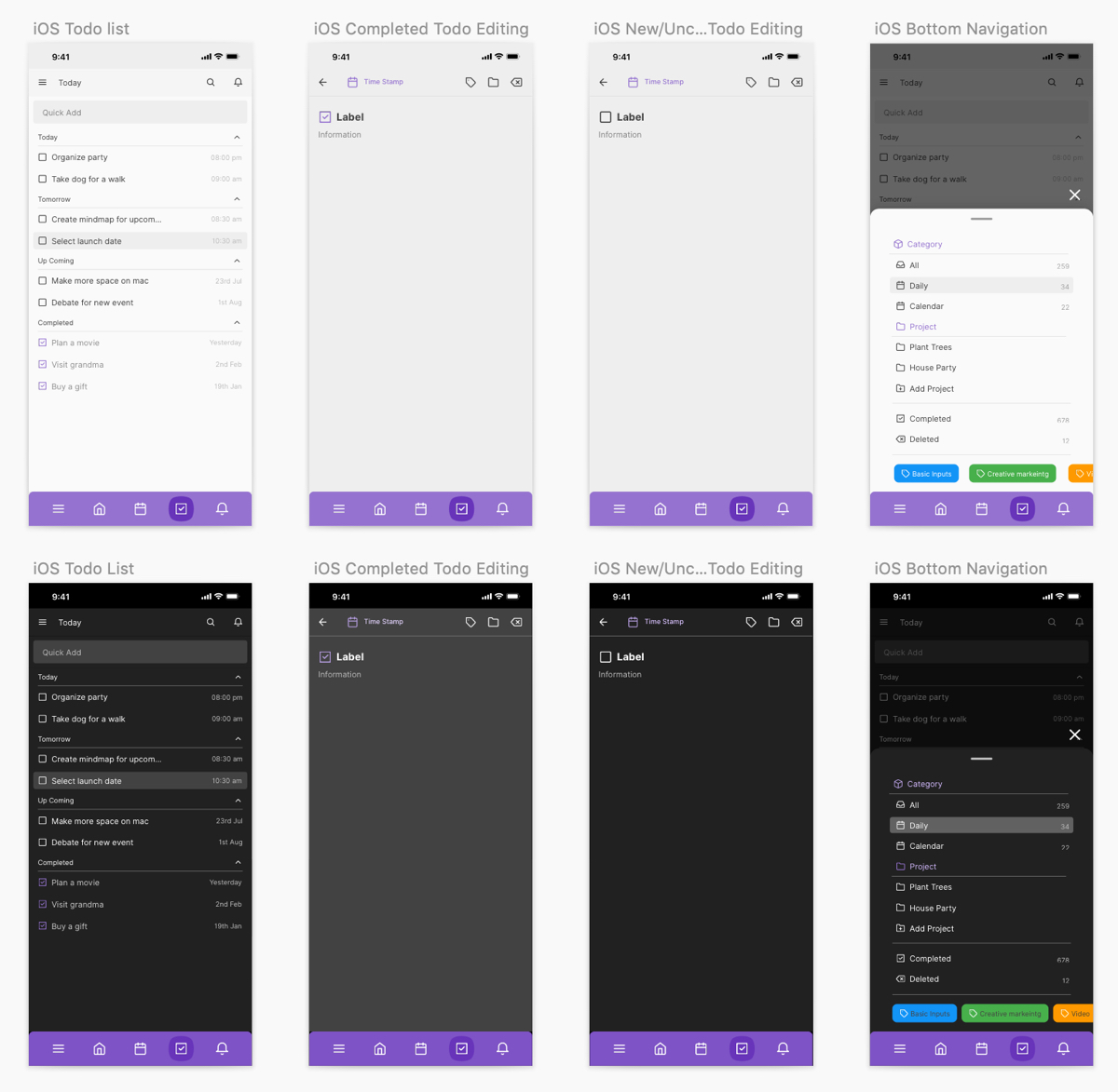
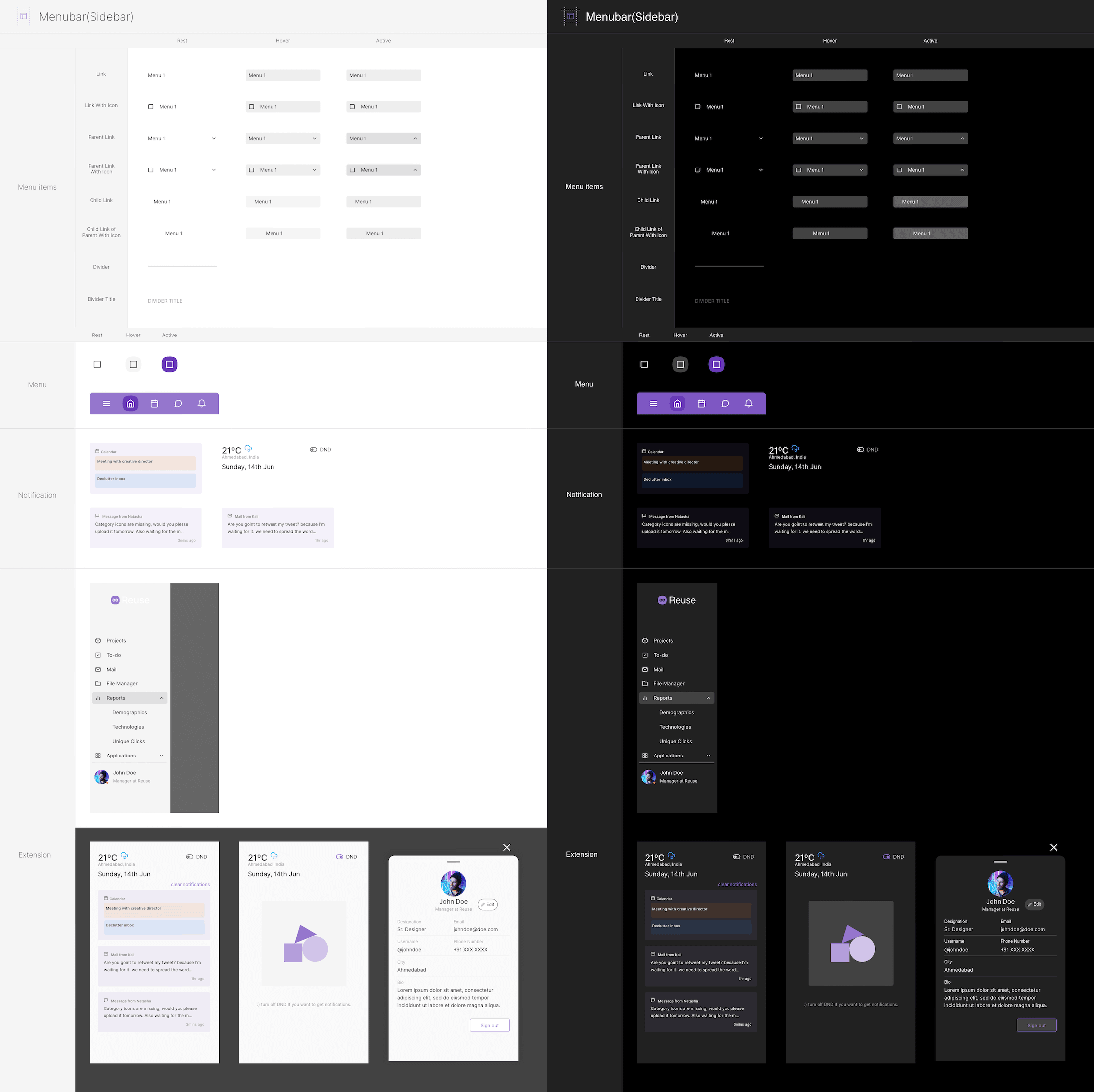
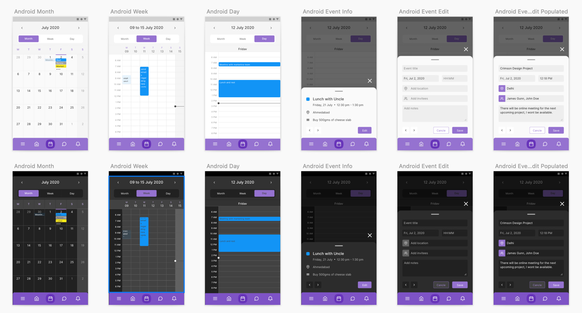
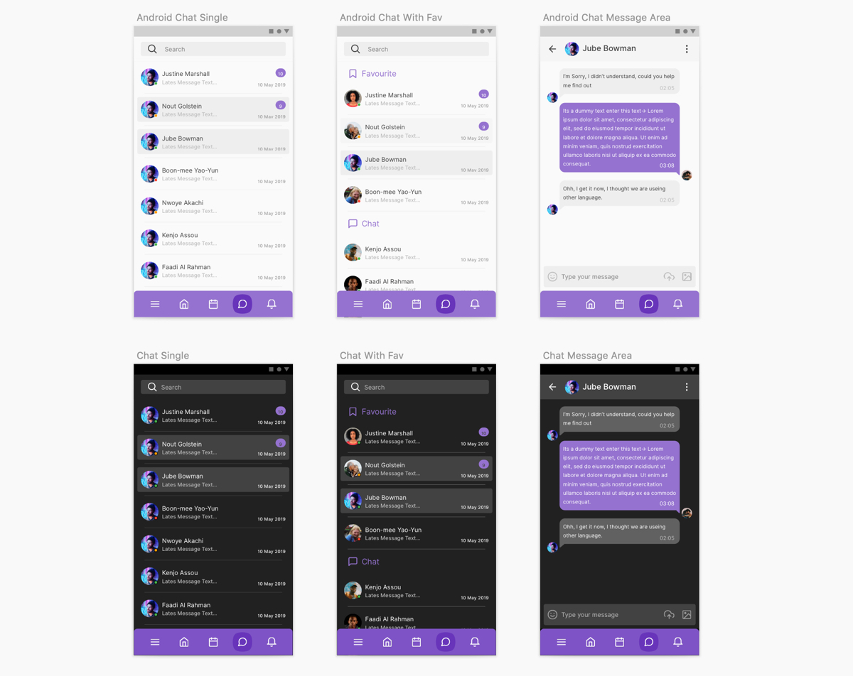
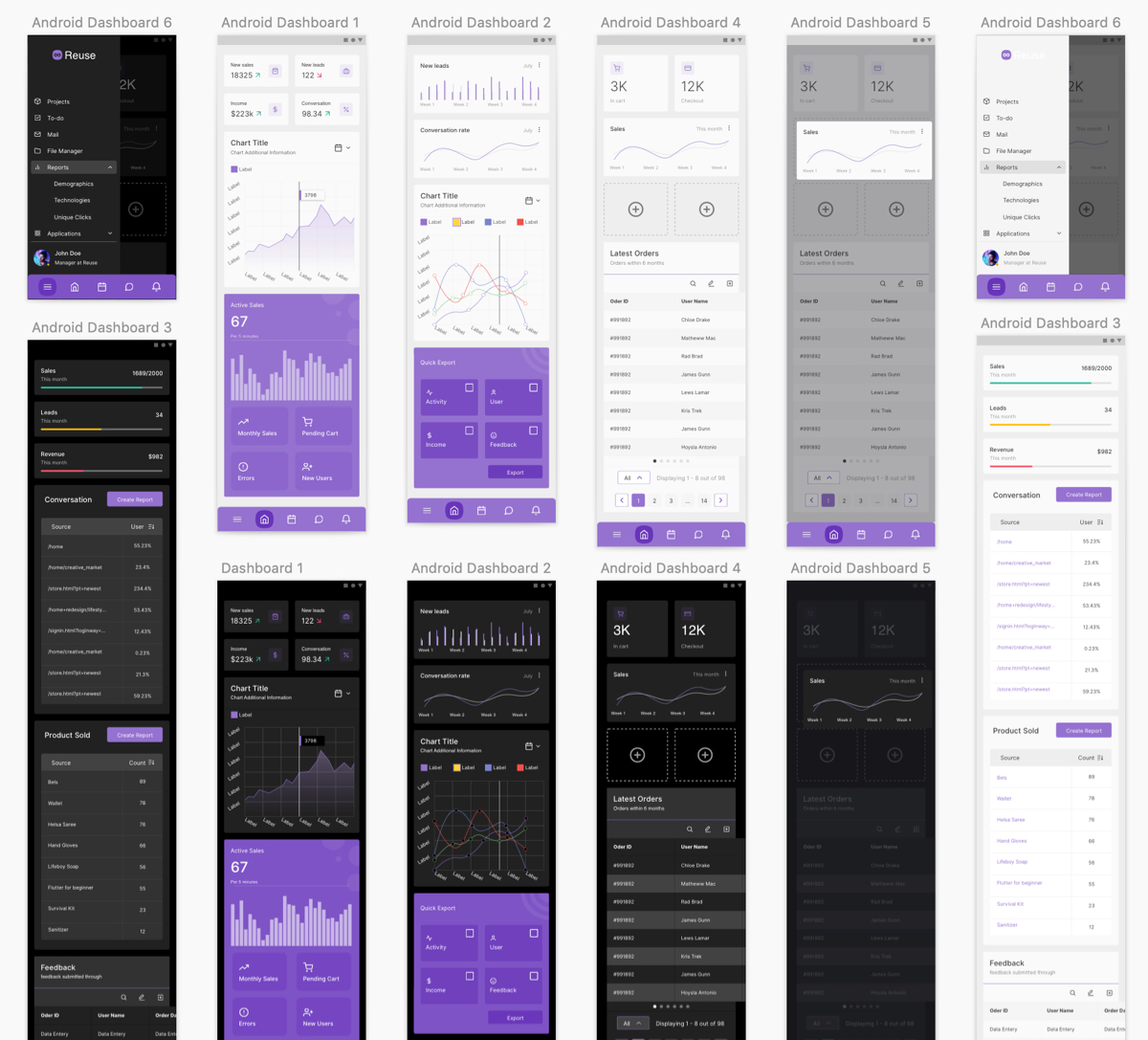
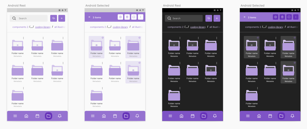
This resource includes 8 pre-made apps for iOS (390x1271) and Android (360x1203) screens. The pre-made apps cover a wide range of common and essential views including: Dashboards, Calendars, File Manager, Chat, Mail app, To-do app, Notifications & Sidebars, and Kanban Project Management app. There are two Sketch files, and you will be able to choose between Dark and Light versions for all design elements.
-
Highlights
All elements are created with Android Material Design and iOS Human Interface guidelines in mind. The elements utilize a 4 column grid system with a tailored width and spacing. The atomic design structure of this resource provides solid methodology and clear expectations.
You will be able to understand the structure and composition of different UI elements very quickly. This organizational model will allow you to design faster and smarter because the components have the same and predictable foundation. Furthermore, the consistent naming convention of Layers, Groups, and Symbols will help you identify components fast and keep a tidy design.
License
The personal license allows for personal projects for one user. The team license allows for personal and commercial projects for a small team. The professionals license allows for personal and commercial projects on unlimited scale. If you work in a team select the team license that corresponds to your team.
-
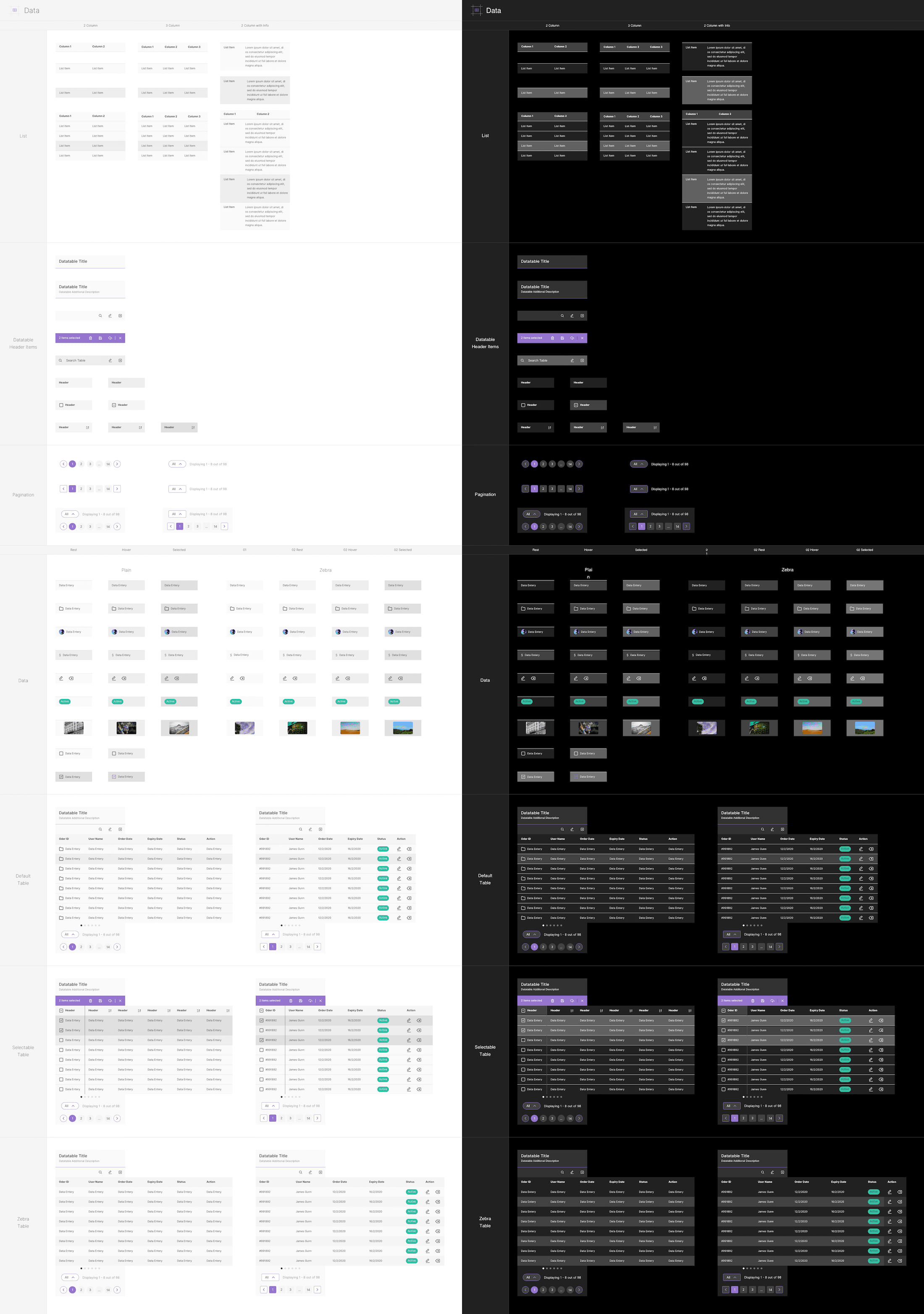
Example of mobile data and table components
Here is what's included in this resouces:
-
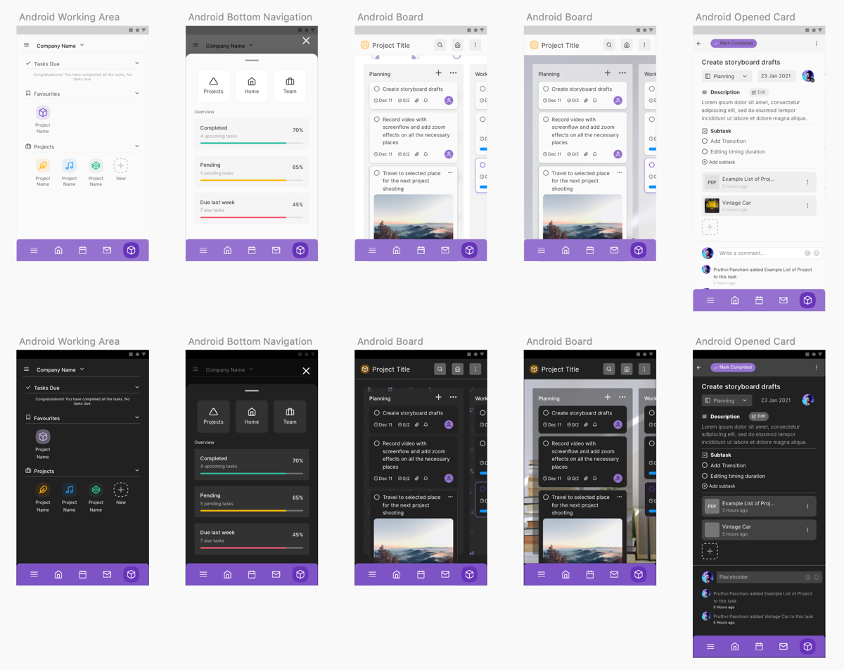
Android - Boards and Kanban Project Management
-
Android - Calendar
-
Android - Chat
-
Android - Dashboard
-
Android - File Manage
-
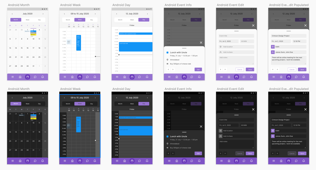
Android - Mail
-
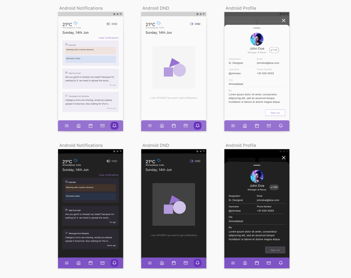
Android - Notification
-
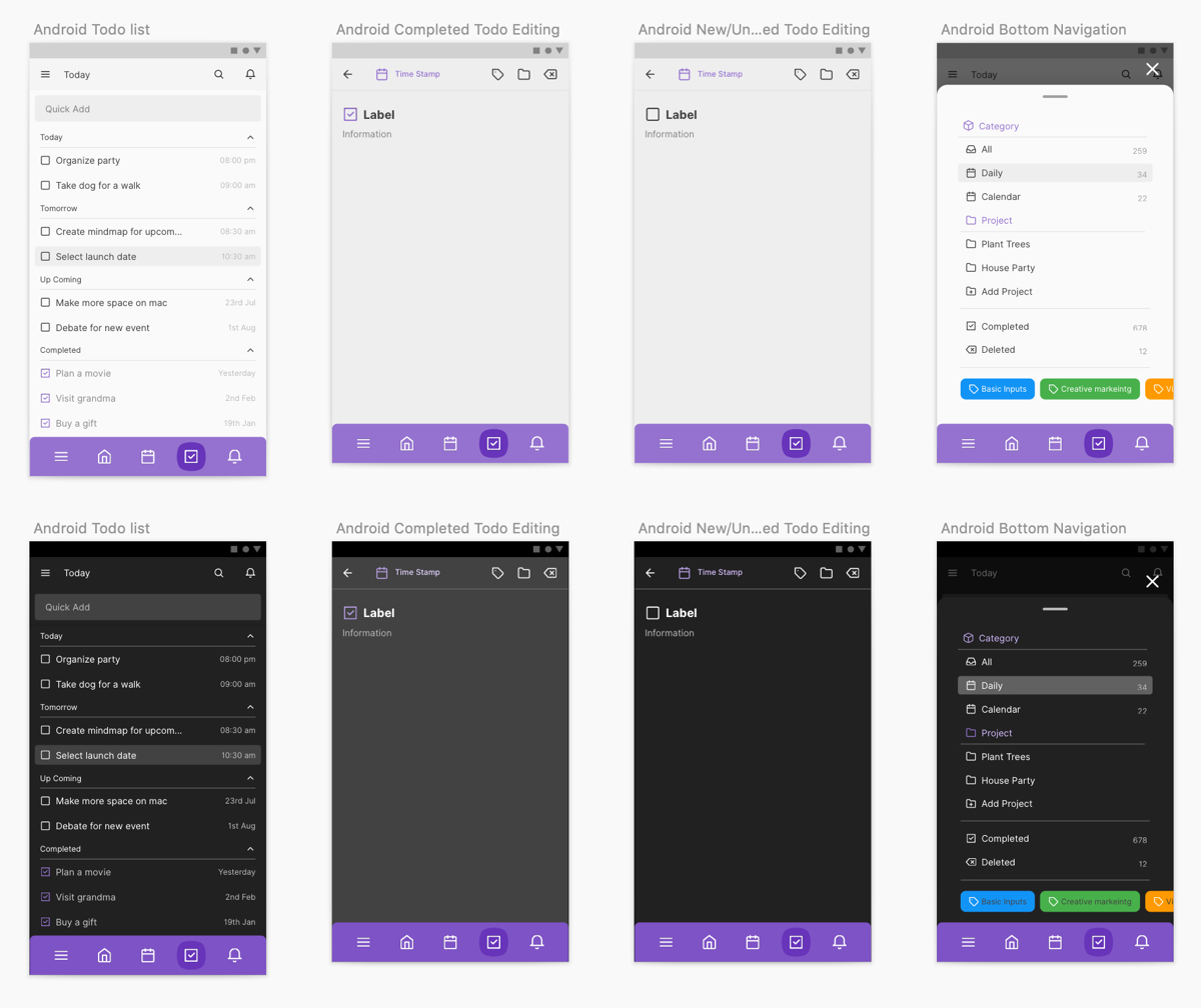
Android - To-do
-
Components - 00 Mobile Data & Tables

-
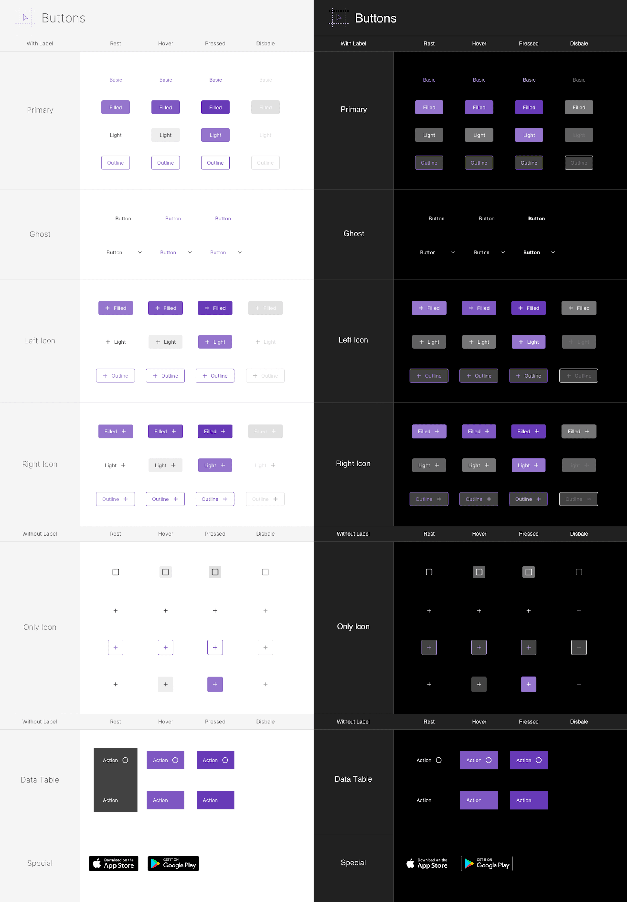
Components - 01 Mobile Buttons
-
Components - 02 Mobile Text Fields (Normal)
.png?v1)
-
Components - 03 Mobile Text Fields (Complex)
.png?v1)
-
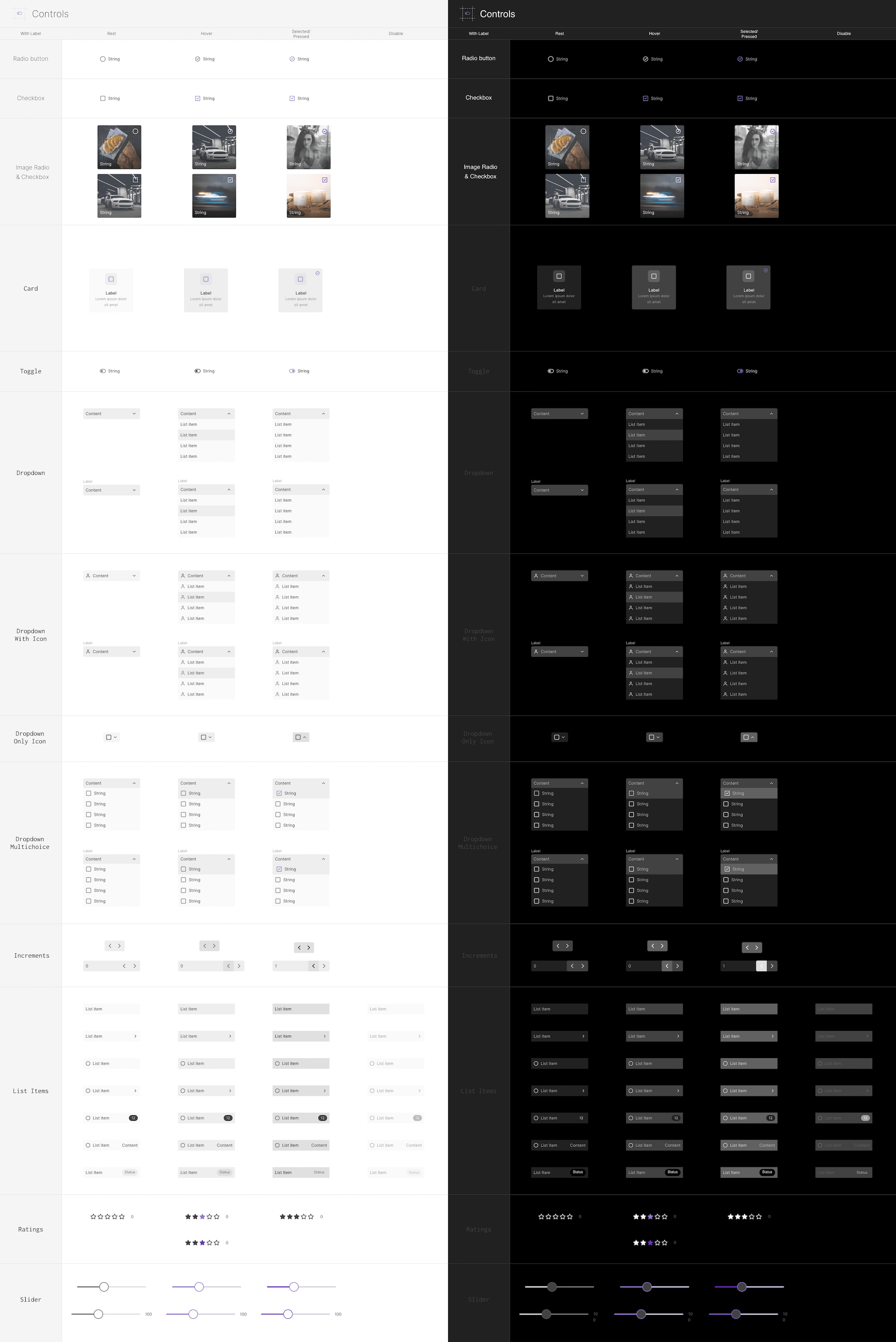
Components - 04 Mobile Controls
-
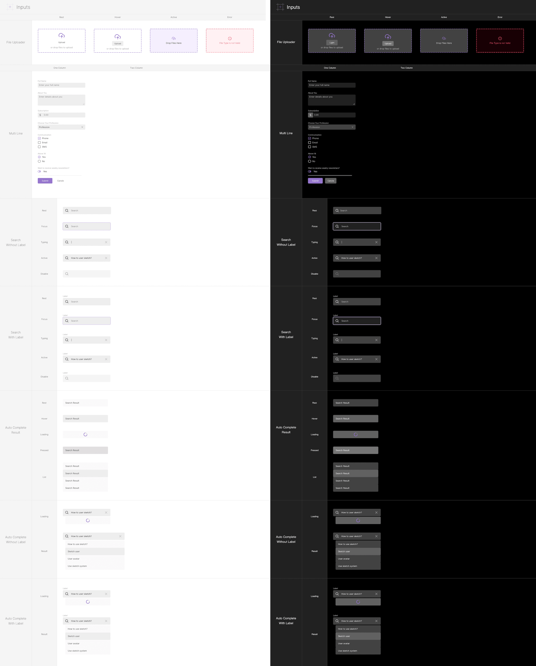
Components - 05 Mobile Inputs
-
Components - 06 Mobile Accordion & Content Switches

-
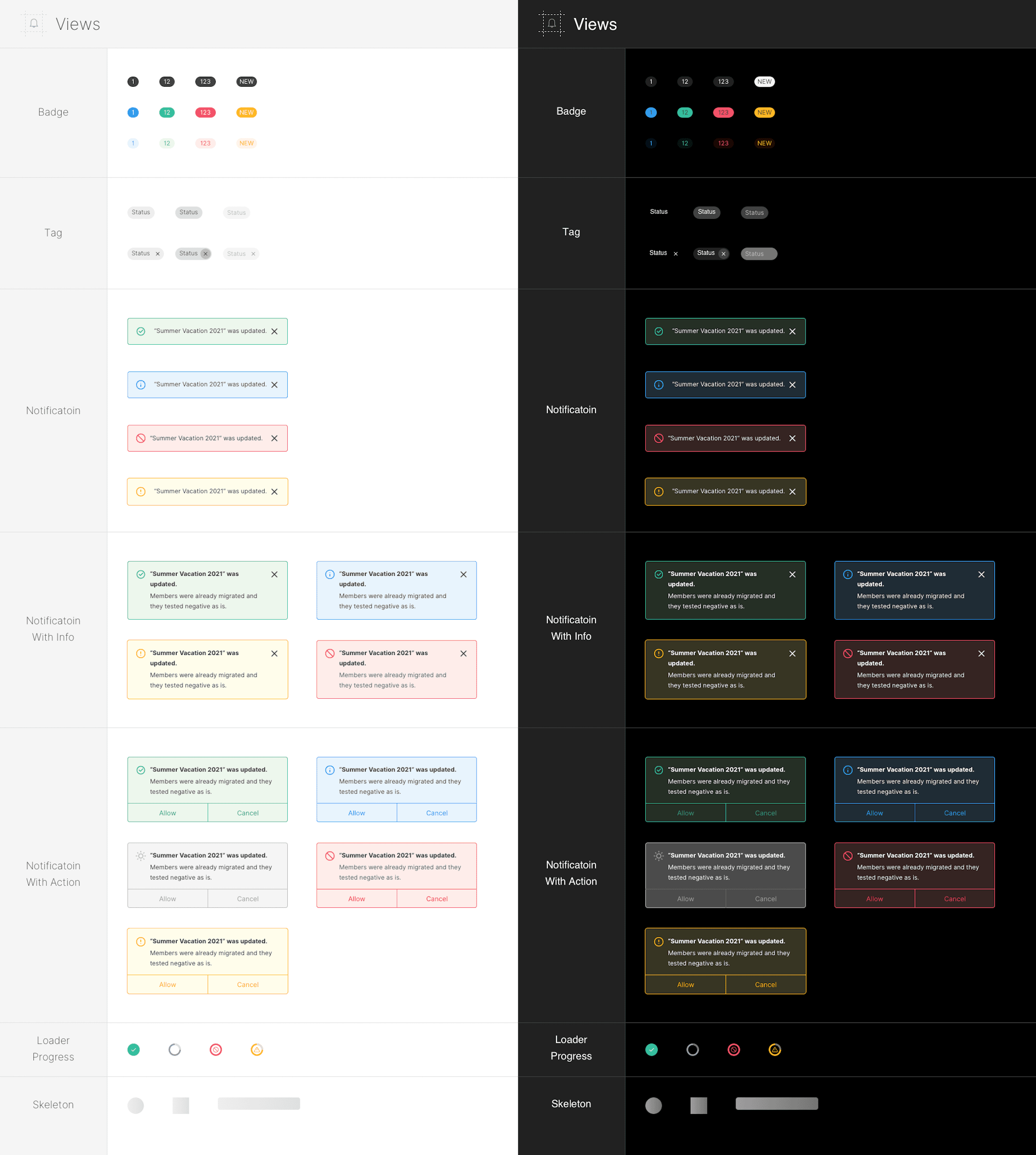
Components - 08 Mobile Notification VIews
-
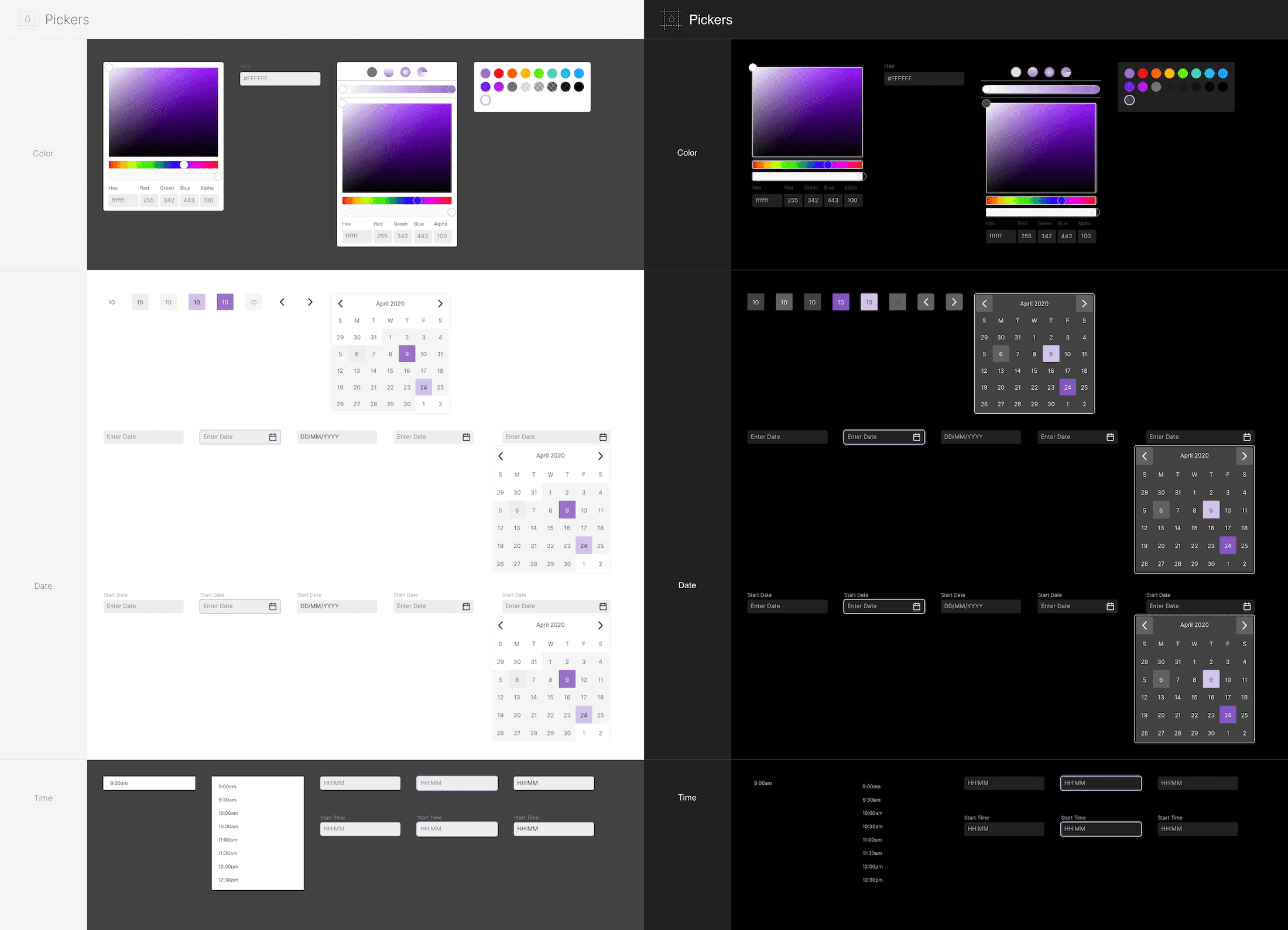
Components - 09 Mobile Pickers
-
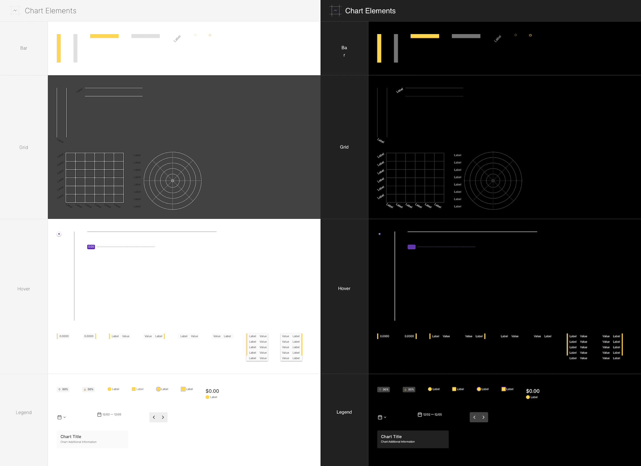
Components - 10 Mobile Chart Elements
-
Components - 11 Mobile Charts

-
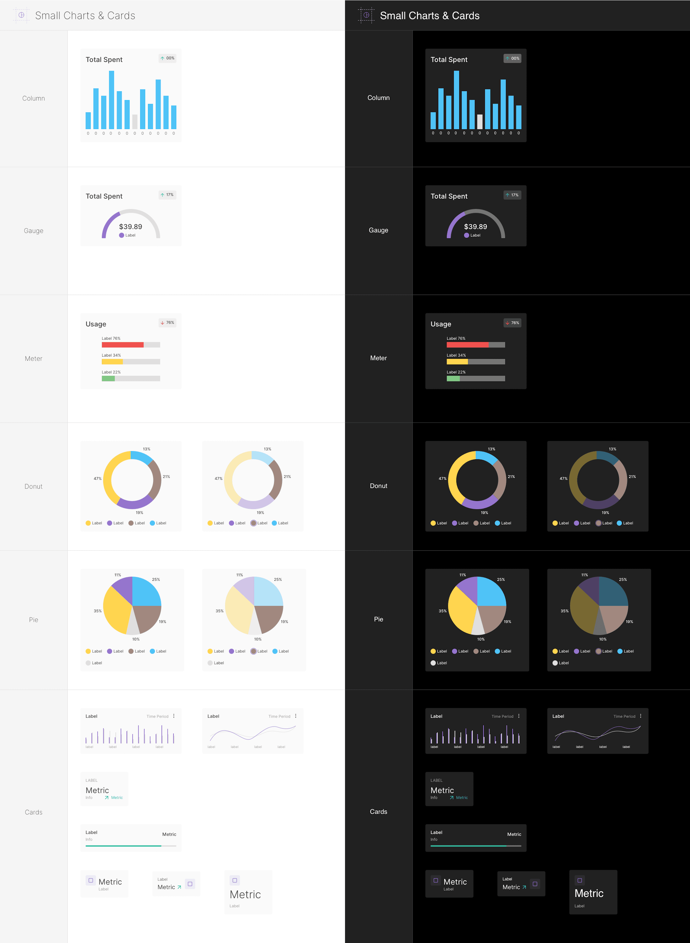
Components - 12 Mobile Small Charts
-
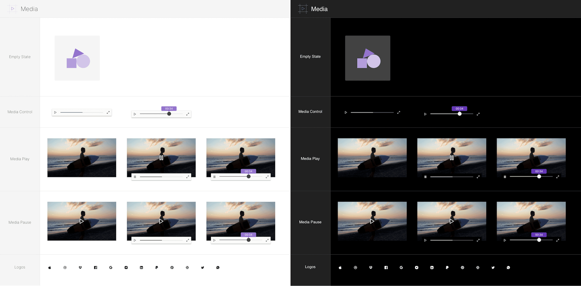
Components - 13 Media Players
-
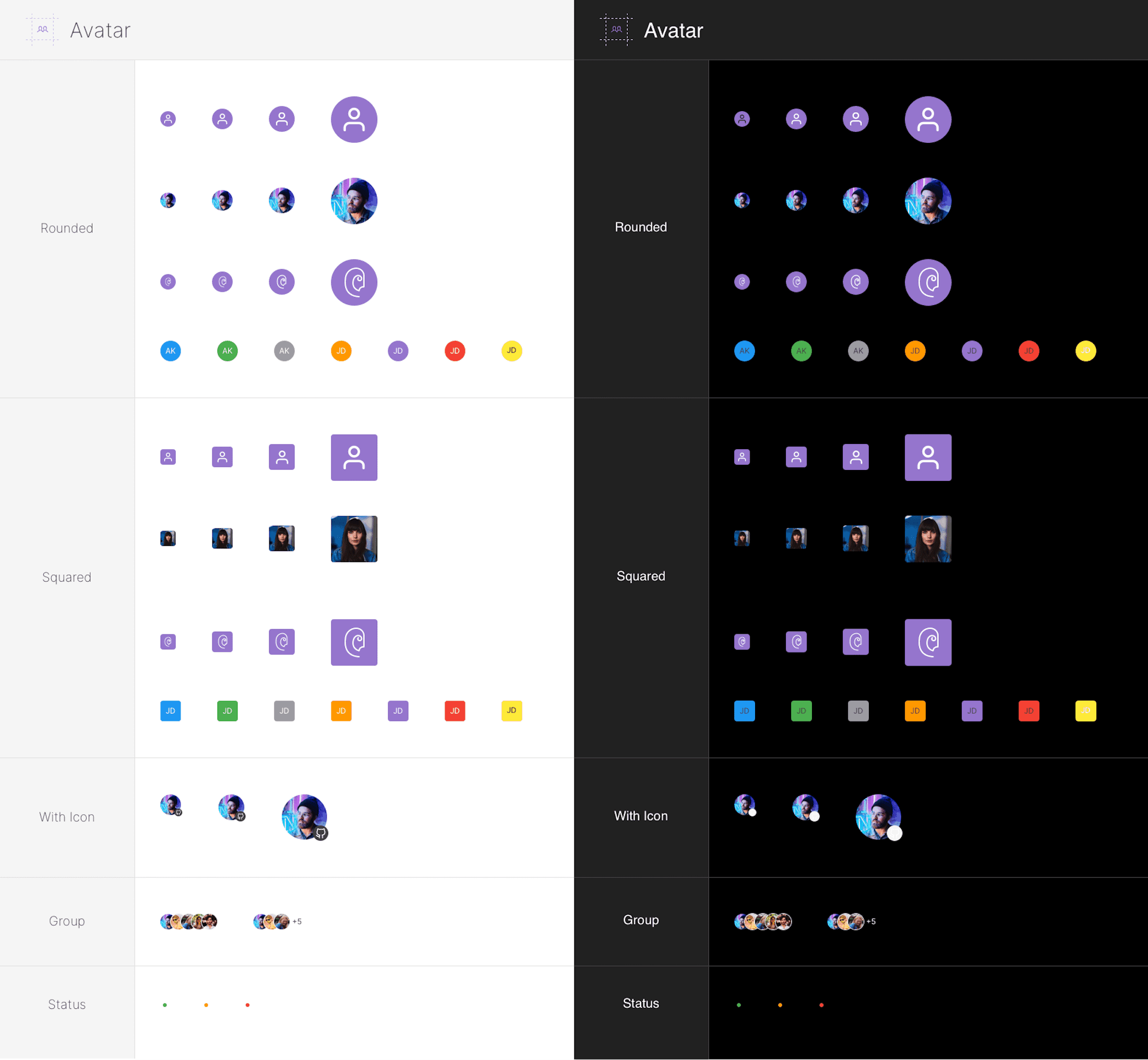
Components - 13 Mobile Avatats
-
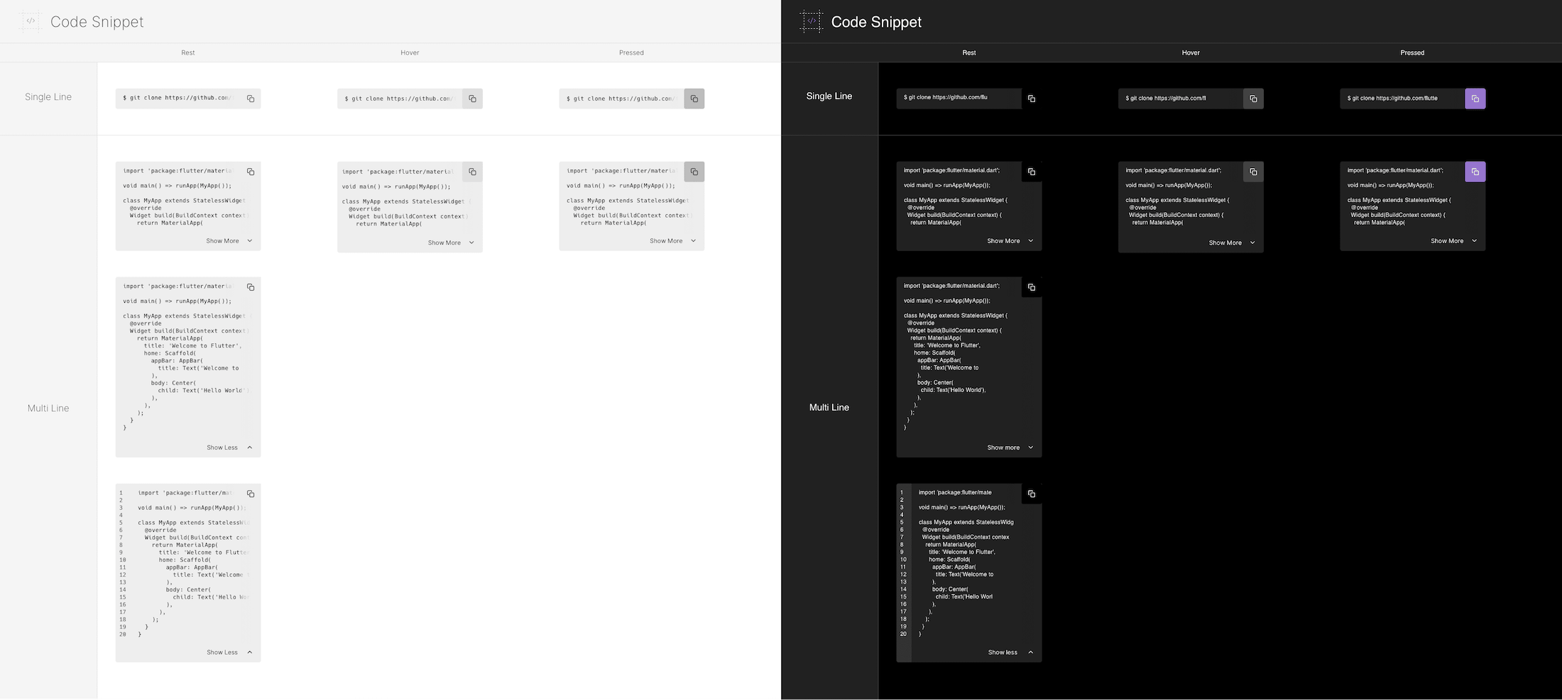
Components - 14 Mobile Code Snippets
-
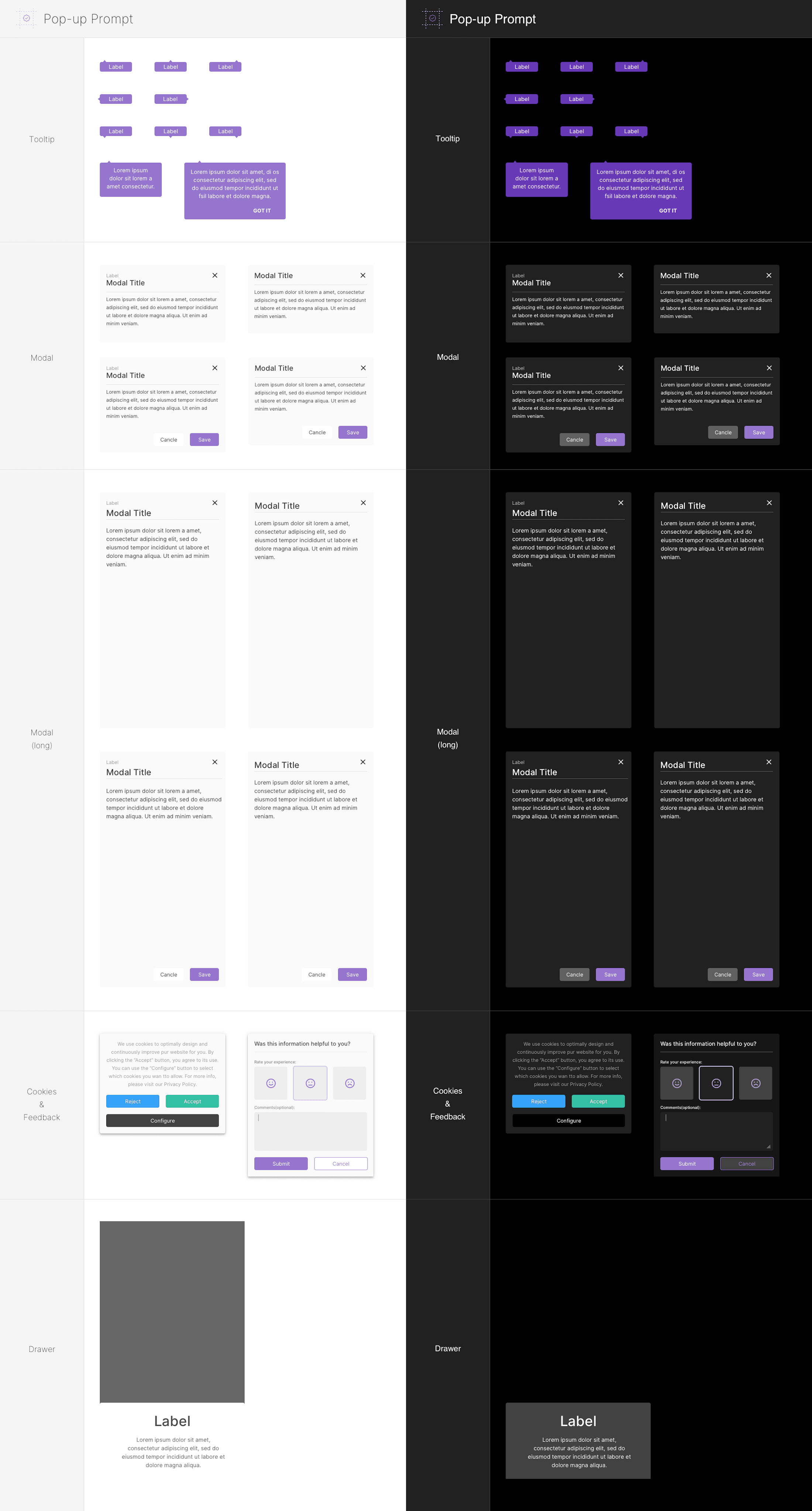
Components - 16 Mobile Modals & Popups
-
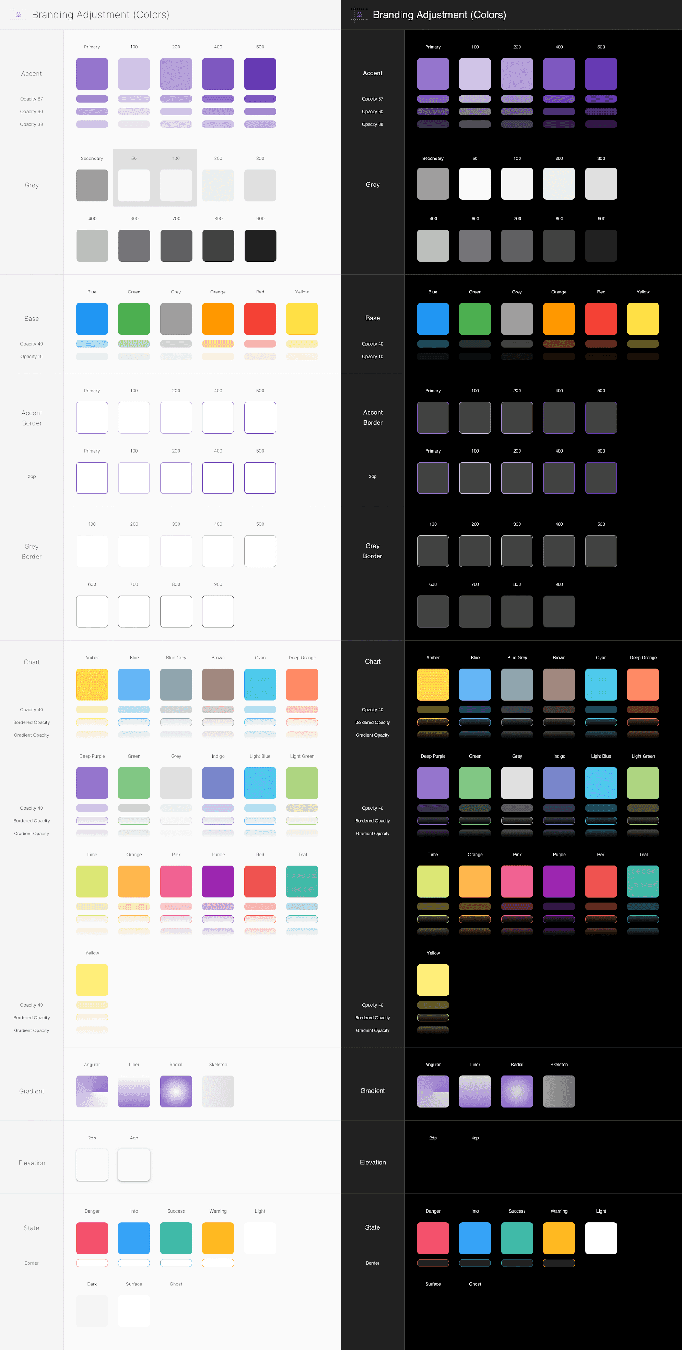
Elements - Colors
-
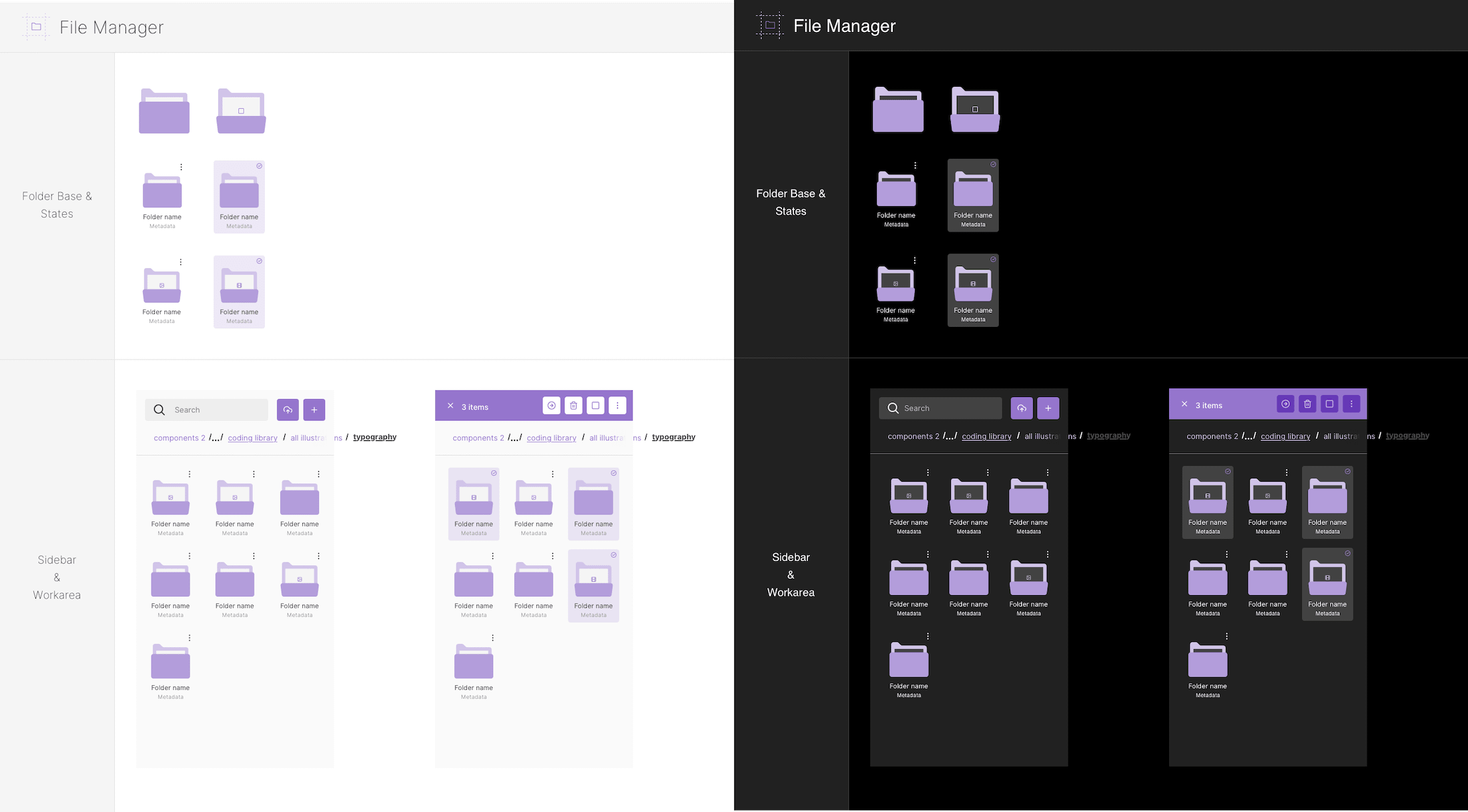
Elements - File Manager
-
Elements - Grid
-
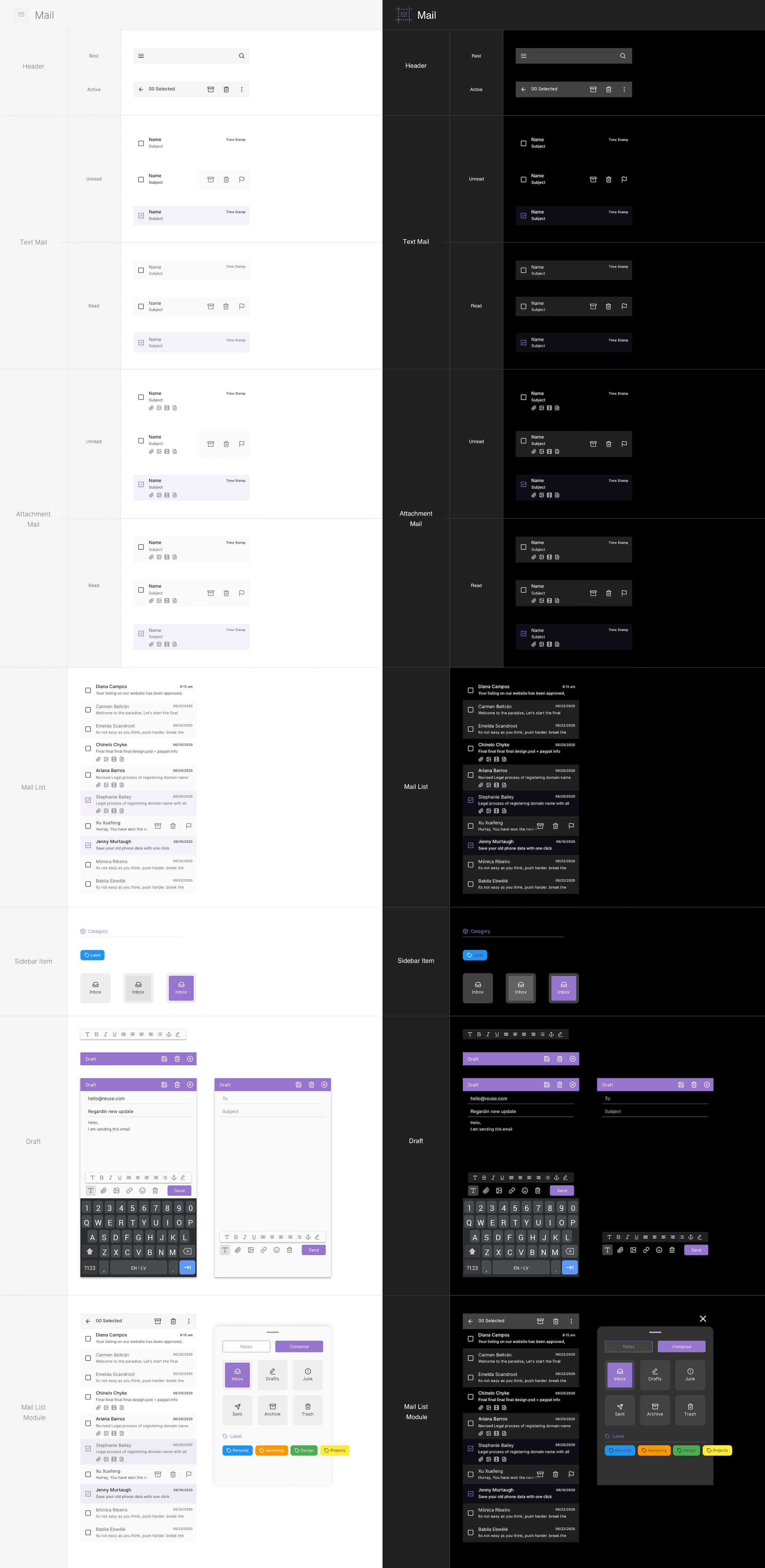
Elements - Messaging & Mail
-
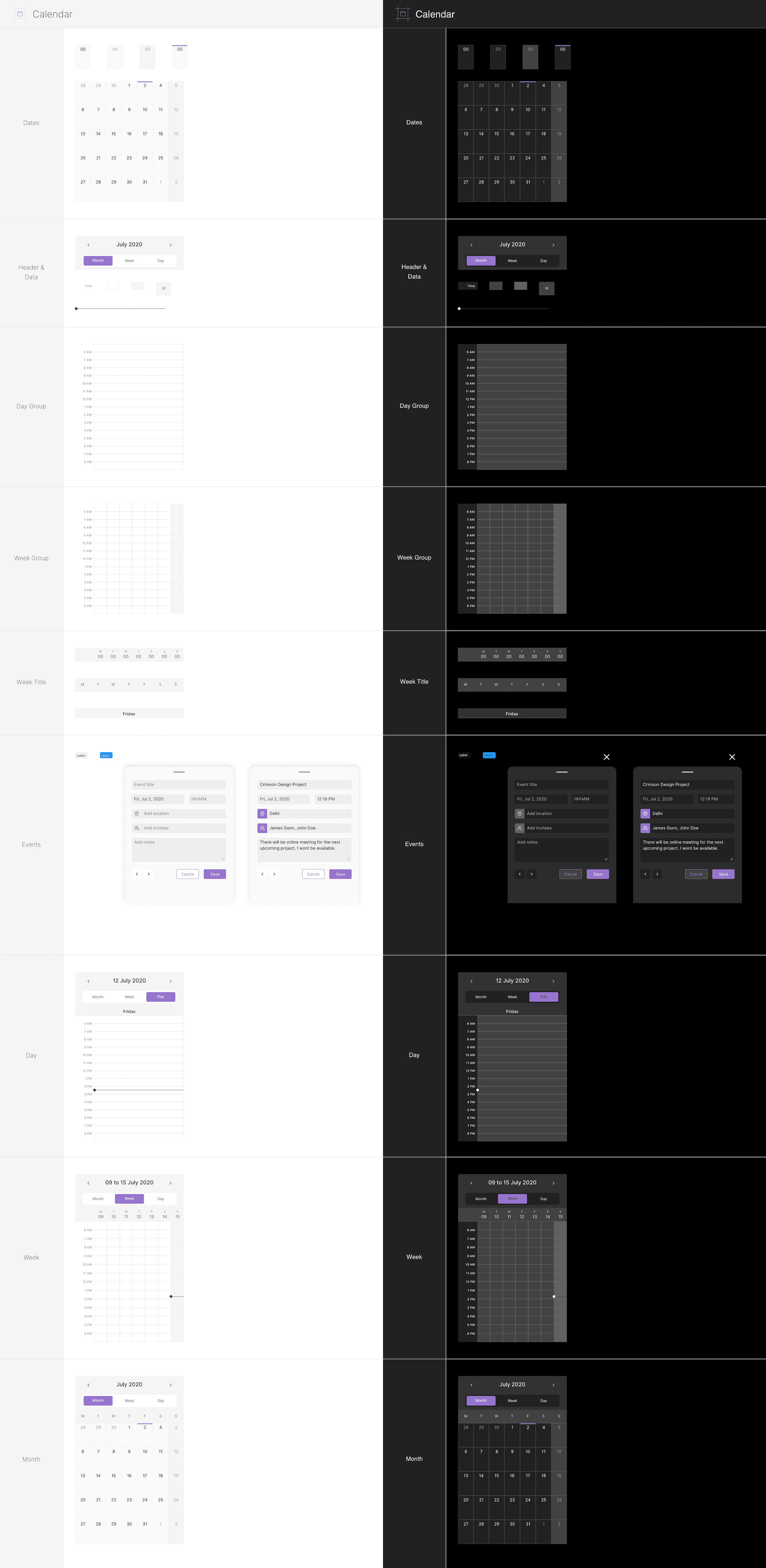
Elements - Mobile Calendar
-
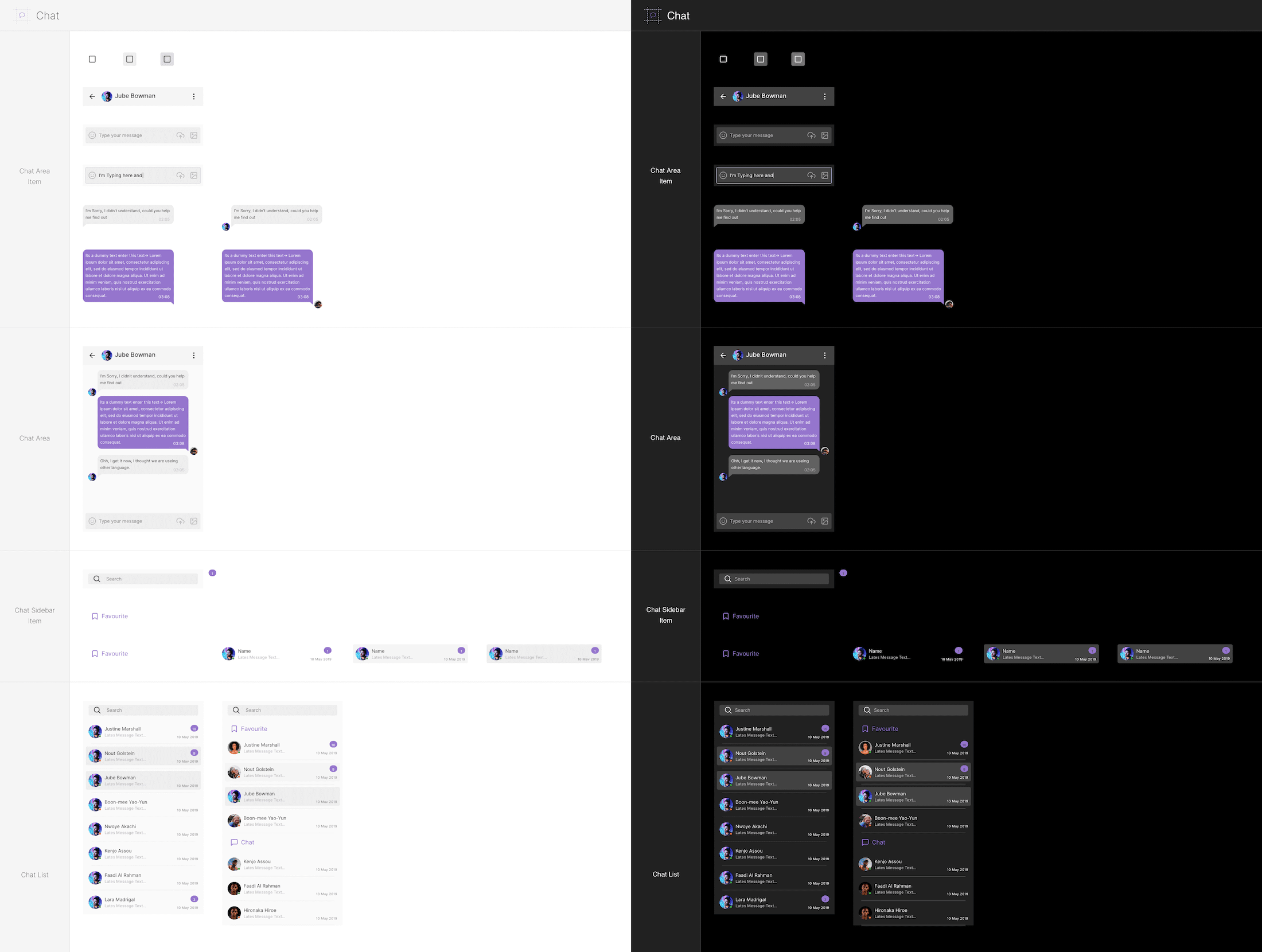
Elements - Mobile Chat
-
Elements - Project Managment

-
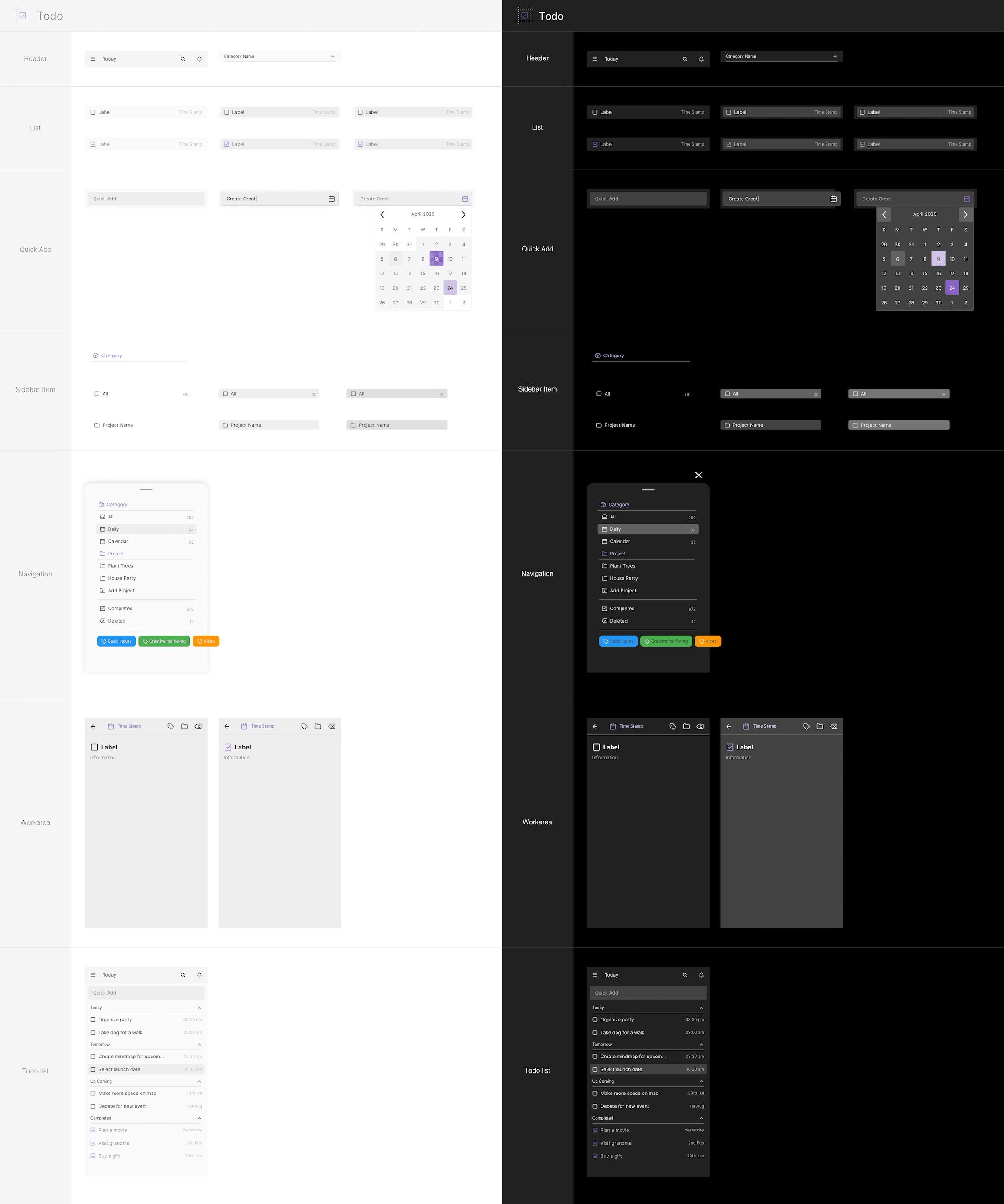
Elements - Tasks
-
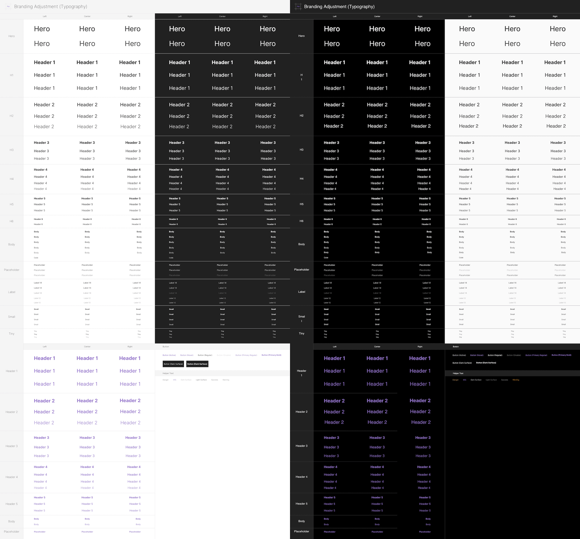
Elements - Typography
-
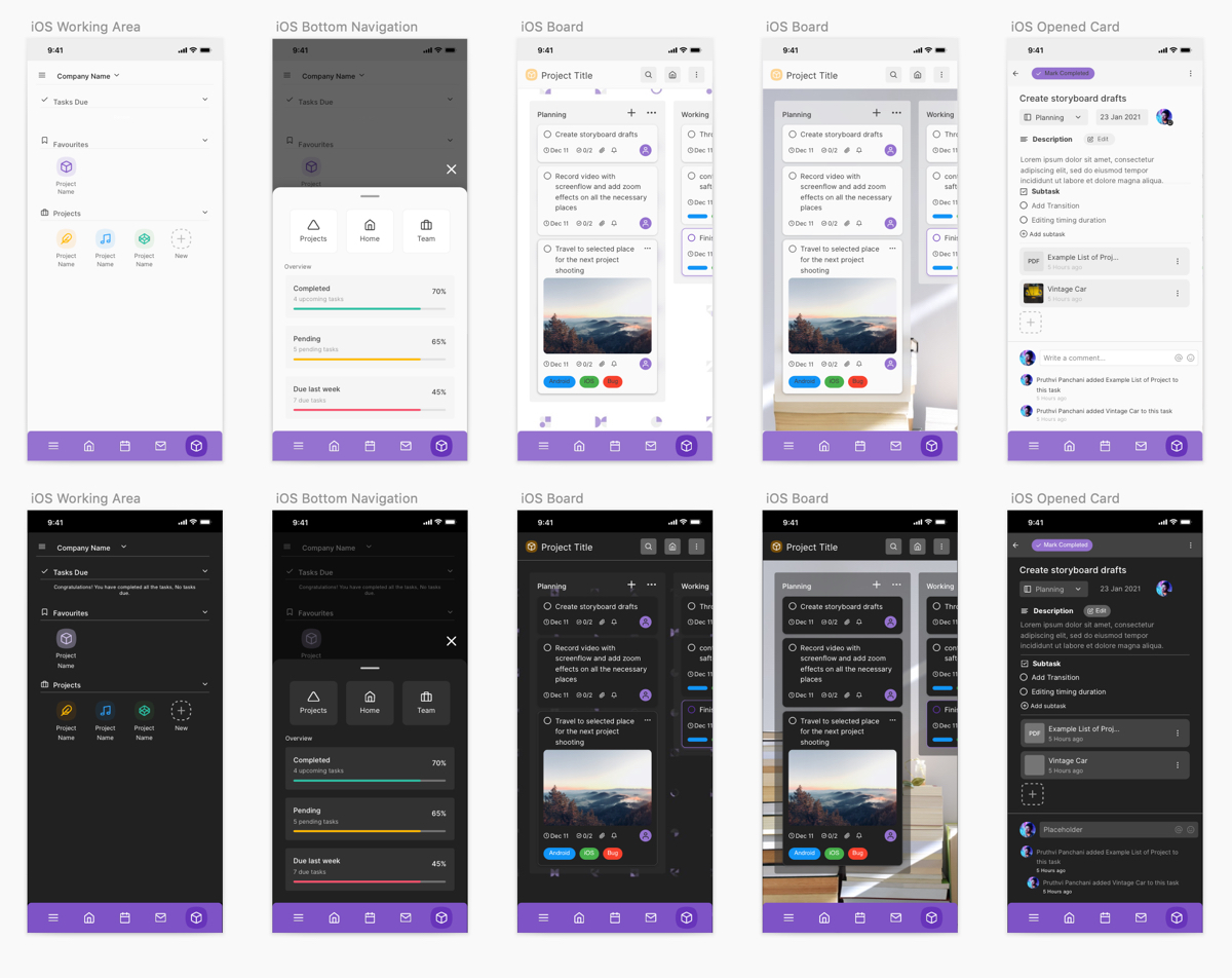
iOS - Boards and Kanban Project Management
-
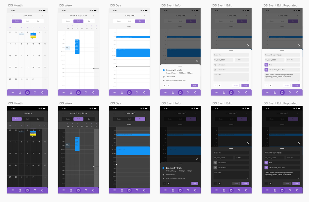
iOS - Calendar
-
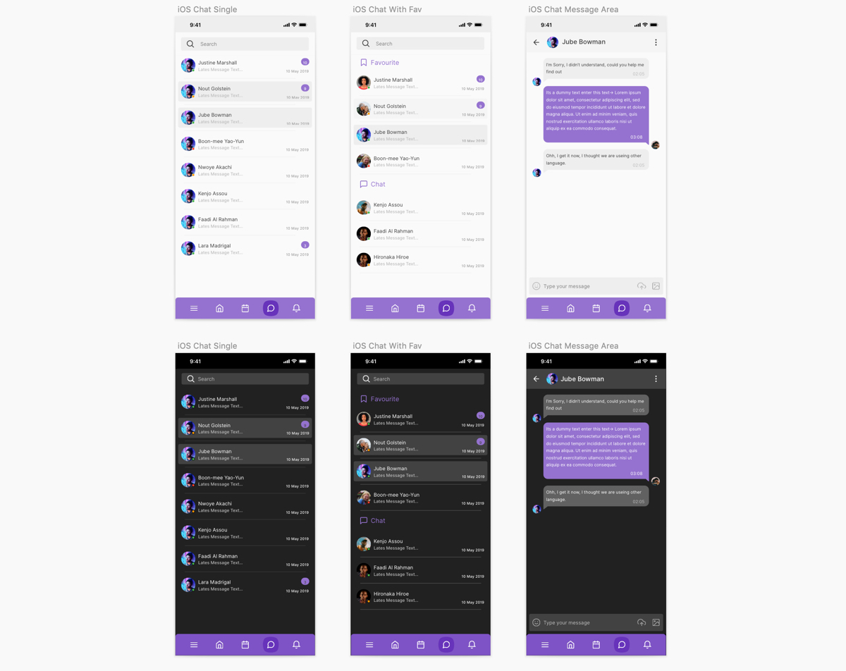
iOS - Chat
-
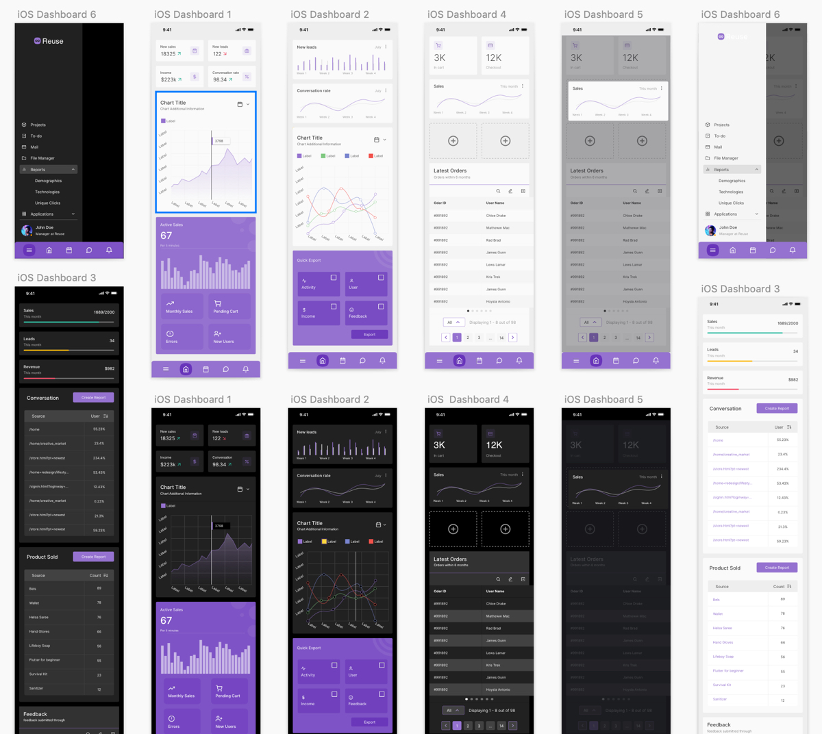
iOS - Dashbaord
-
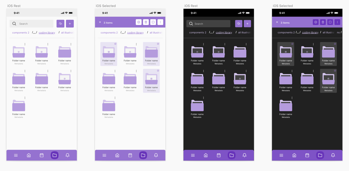
iOS - File Manager
-
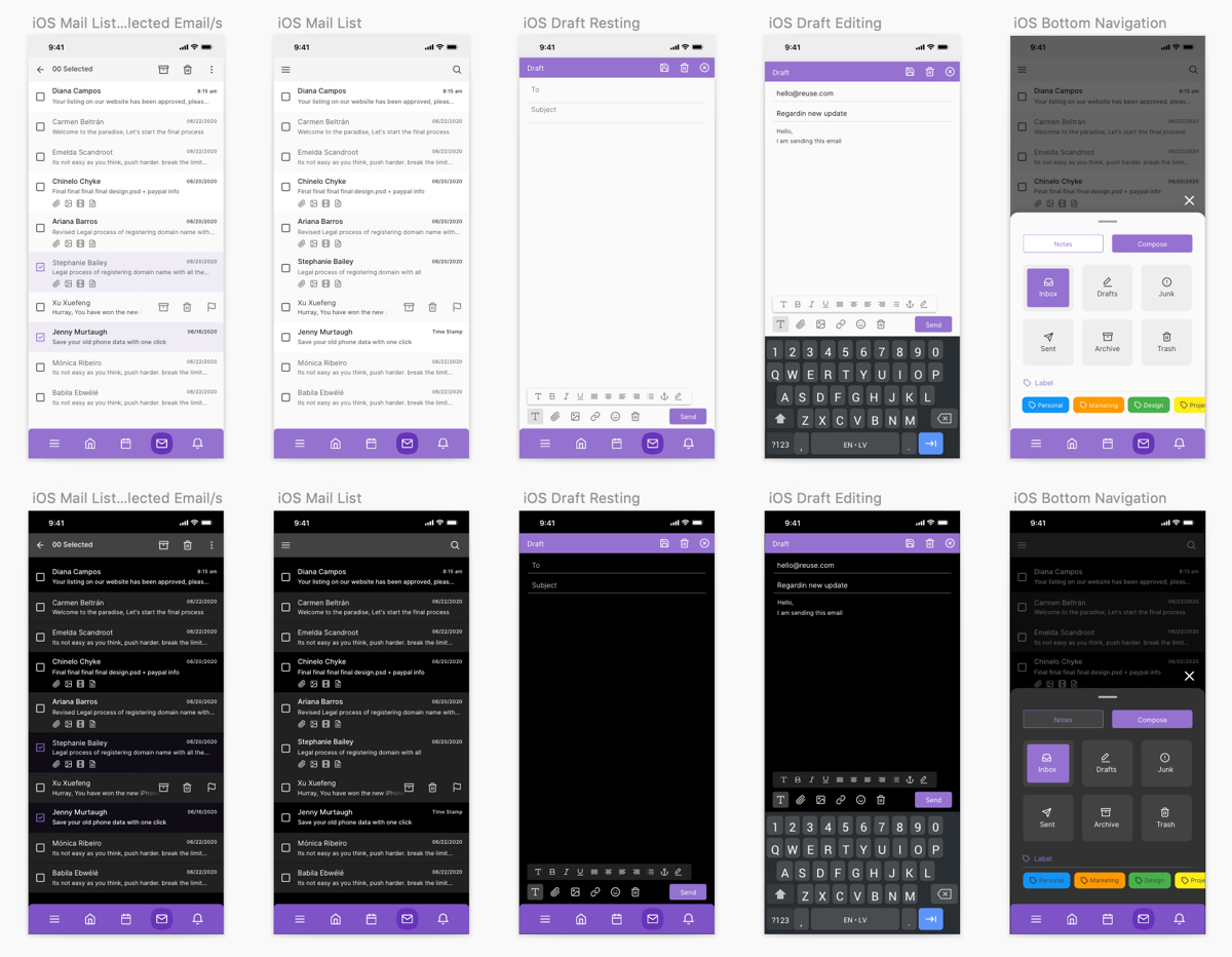
iOS - Mail
-
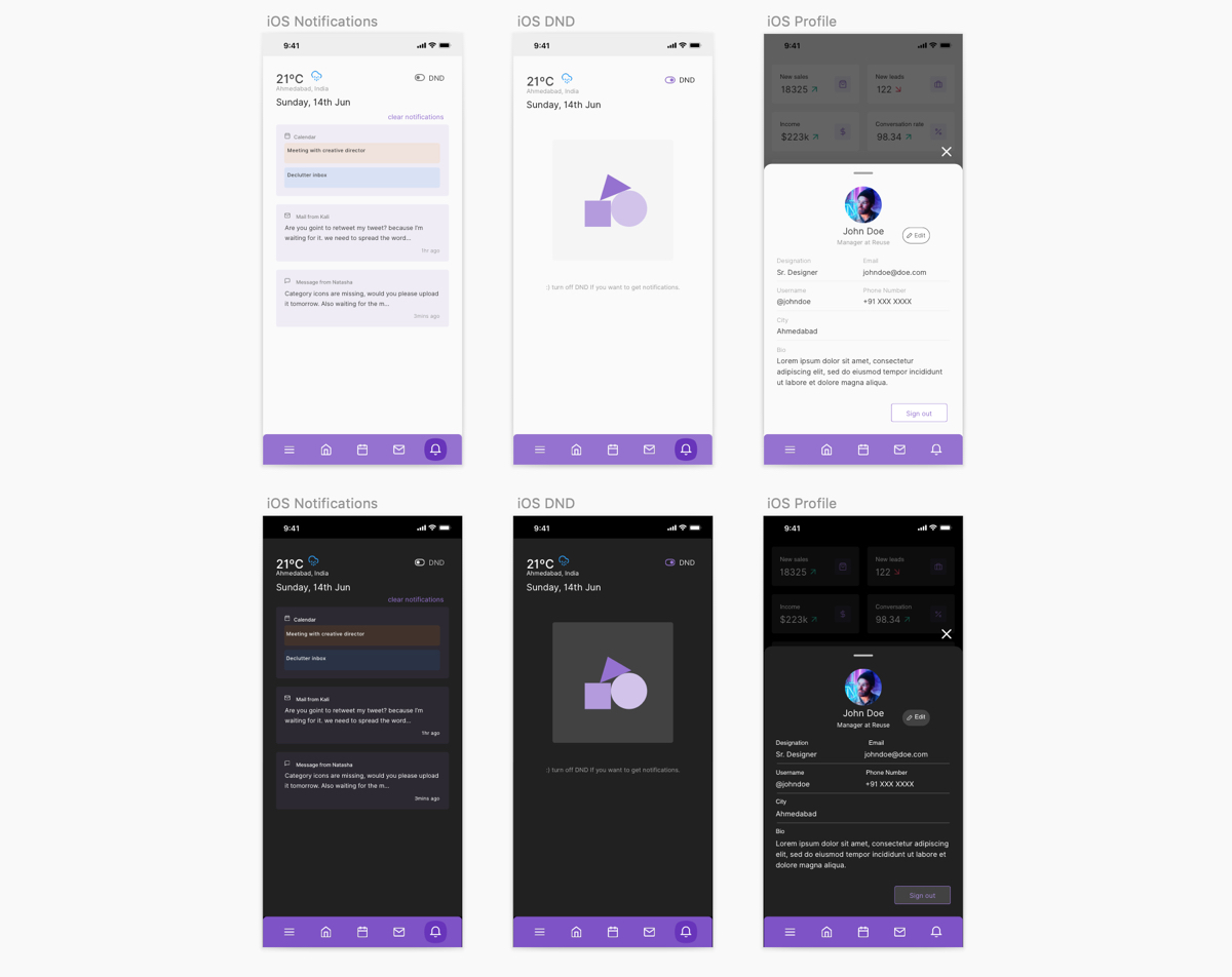
iOS - Notification
-
iOS - To-do
